What Is “The User Is Drunk”?
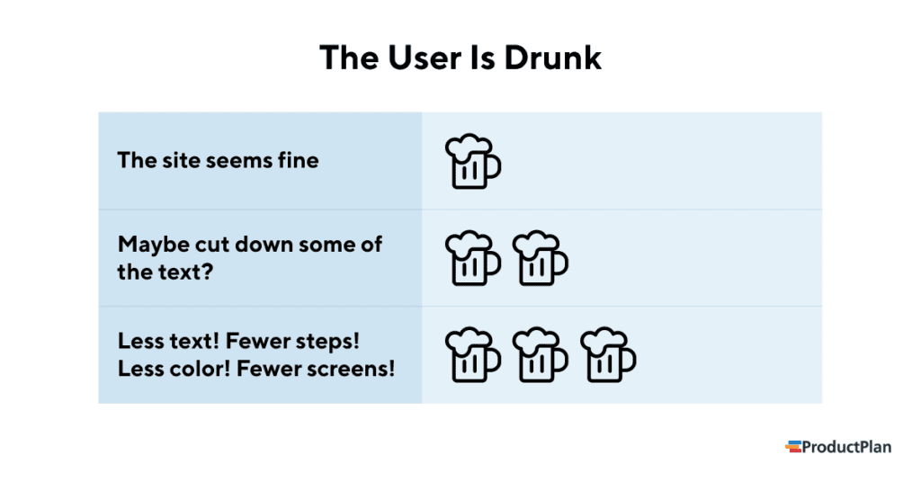
“The User is Drunk” is a product management and UX design concept that emphasizes designing products or websites so intuitive and straightforward that even someone under the influence of alcohol could use them. The term also describes the method of testing how direct a site or app is. How? By asking someone drunk to try using it.

Where Did The User Is Drunk Come from?
UX designer and developer Richard Littauer came up with the idea for The User Is Drunk. Littauer’s original concept was to offer a service where companies would hire him to review their website or app while intoxicated.
As Littauer explains on the homepage, he created to offer this service, TheUserIsDrunk.com:
Your website should be so simple a drunk person could use it.
You can’t test that. I’ll do it for you.
The service was an immediate success. Littauer’s website, TheUserIsDrunk.com, received hundreds of thousands of page views in its first few days. The number of companies contacting him to order his service grew so large that he soon had to stop taking on new clients.
Why Should Designers Build Products with this Concept?
There are a couple ways product managers and UX designers can benefit from building their apps as though the typical user will be drunk. Here are two of the most important:
1. It forces the design team to keep it simple.
As they build an app or website, the product and UX teams become so familiar with it that they know immediately where to find everything and how to navigate to every tool or feature. It can cause the team to lose objectivity about how intuitive the product truly is.
Building a UX for a user who might be drunk forces the team to think through a newcomer’s experience. This person won’t know where everything is right away and won’t necessarily be able to find things quickly if they aren’t as straightforward as possible.
With that hypothetical user in mind, the team will be more likely to shave off unnecessary steps or clutter and make the experience as simple and inviting as possible.
2. It replicates the scenario of a distracted user.
So many big-budget advertising campaigns fail. Often, both the agency that creates the ad and the brand itself give the ad their full attention when they review it. The agency brings the final cut to the client’s offices and plays the ad on a huge screen with the volume cranked up.
But in reality, when that ad plays across the country, most people will be only partially aware of it. They’ll be checking their phones, walking to the kitchen to grab a drink, or heading to the bathroom.
As Littauer pointed out in several interviews about his service, UX teams tend to design their products under the misguided assumption that every user will give it their full attention. In reality, though, most people visit websites or log into apps while distracted by other things.
This is another reason it’s a good idea to design a product for a potentially drunk user. Being drunk is a good proxy for being distracted and unable to devote 100% of your attention and mental energy to executing a task.
Navigating your app should be a simple task, even if the user only partially focuses on it. (Or drunk.)
Related Terms:
User experience (UX) / UX designer / product designer / story mapping / prioritization