What Is an Affinity Diagram?
An affinity diagram helps a team visualize and review large amounts of information by grouping items into categories. Instead of analyzing each idea on a long list without context, the team can spot trends and patterns. Seeing those patterns can help them make better decisions.
When Should You Use an Affinity Diagram?
Professional teams use affinity diagrams to help make sense of many types of information. Here are a few common examples for product teams.
1. Grouping ideas into categories during a brainstorming session.
Imagine a product team discussing which type of customer or market to target next. If the team simply wrote out a long list of candidates, they would need to evaluate each separately.
But if they grouped them into categories, the team could see more easily if several ideas on the list favored one category. That could help the team then delve into the strategic reasons they seemed interested in one type of market over the others.
2. Identifying strategic themes worth pursuing.
Imagine a product team trying to come up with feature ideas for a new product. Using an affinity diagram, after the team members wrote their ideas, they could group these ideas into major strategic themes. Some ideas might fall under the Create Customer Delight theme, for example. Others would fall under a theme called Product-Led Growth.
By grouping these suggestions into themes, the team will gain a sense of what its members view as the most important strategic goals.
Read 5 reasons to organize your roadmap by themes →
3. Uncovering priority issues the team might miss.
Imagine a product team with a long product backlog. Without grouping the backlog items into categories or themes, the team might miss a pattern or trend. This means the team could miss an opportunity to prioritize a category that is becoming mission-critical to the product.
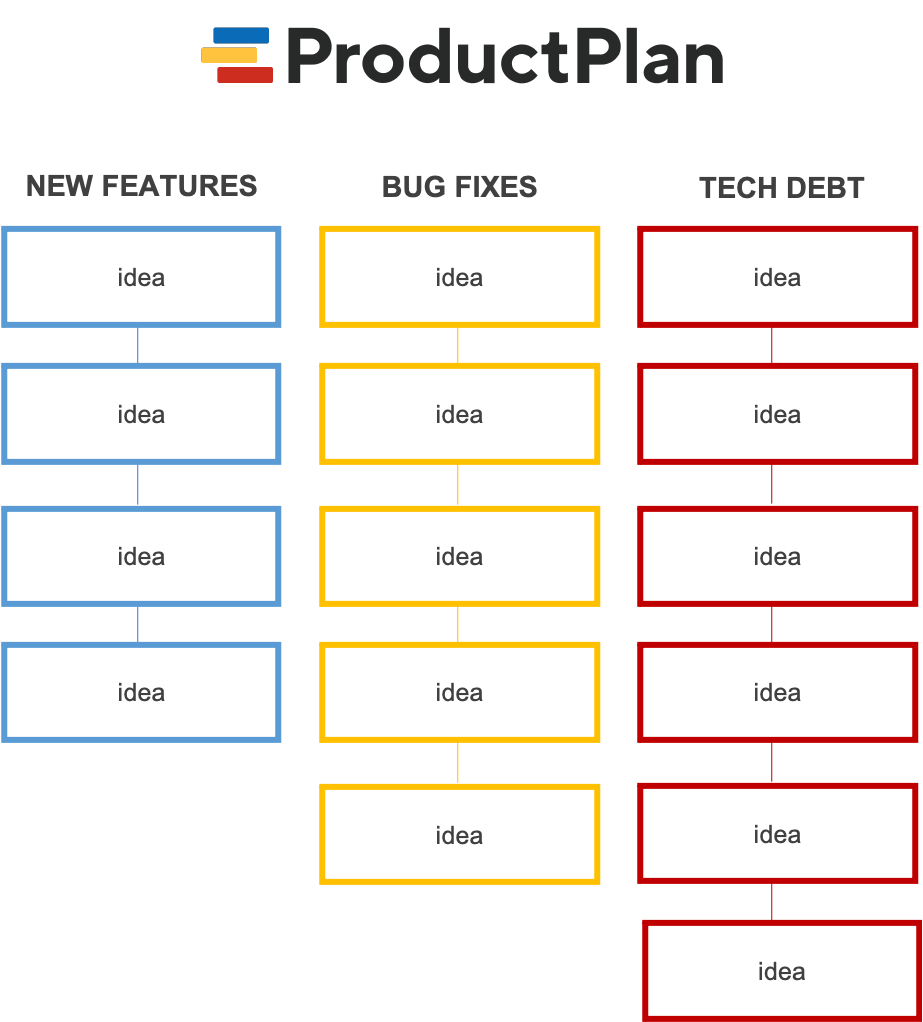
For example, maybe the backlog contains many items the team needs to address to keep its product from amassing too much technical debt. If the team used an affinity diagram to review the backlog, they could group those items into a Technical Debt bucket. If they saw a long list of those tasks, they would realize it was time to prioritize work on reducing technical debt.
How Do You Create an Affinity Diagram?
Step 1: Write each item (data point, idea, etc.) on a separate card.
Let’s say your team wants to review customer feedback to uncover common themes from your product’s users. Using the affinity diagram approach, your first step will be to write down a summary of each piece of feedback on a separate card.
You can use 3×5 index cards or small slips of paper. Sticky notes are the most common format because they can be easily added to a board and then moved around as needed.
Step 2: Review and sort all of the items as a team.
When your team has written down all of the feedback summaries from your list, it is time to group them into themes or categories.
During this step, the team will put all cards into a central pile and review them. The team will then sort and group the cards into common categories based on their similarities.
Step 3: Create affinity headers for all categories.
Let’s say your team groups all feedback summaries into three categories. Some feedback describes requests or ideas for new features. Other feedback describes problems users have with navigating your product. A few pieces of user feedback are complaints about the product’s existing functionality.
The next step is to create category summaries, called affinity headers, to describe these three groups. You might write your headers as follows: New Feature Requests, UI Complaints, and Functionality Complaints.
Step 4: Build the affinity diagram.
Now that your team has written its three affinity headers at the top of your board, now it’s time to add all of your cards or sticky notes under the appropriate header. You can use the mockup diagram in this post for guidance as to what the finished board will look like.
Step 5: Review and prioritize the cards on your board.
With all of the data points or ideas now arranged on the board under the correct header, your team can start to identify trends.
For example, you might notice that a majority of items fall under one category. If you are reviewing user feedback looking for common themes, you might find many customers are asking for the same type of new functionality. That can help guide your team’s decision-making.
Related Terms
affinity grouping, idea management, prioritization, weighted scoring, SMART goal setting
Learn More
The Ultimate Guide to Product Management
The Ultimate Guide to Product Management Prioritization Frameworks